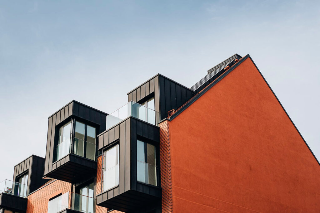
The Power of Color
Color is more than just a visual element in interior design; it’s a powerful tool that can influence mood, perception, and functionality within a space. From calming blues to energizing reds, the colors you choose can dramatically transform the atmosphere of your home or office. In this blog, we’ll explore the impact of color in interior design and offer tips on how to use it effectively to achieve the desired effect in your space.
1. Understanding the Psychology of Color
a. Warm vs. Cool Colors:
Colors can be broadly categorized into warm and cool tones, each evoking different feelings and responses:
- Warm Colors (Red, Orange, Yellow): These colors are associated with energy, warmth, and comfort. They can make a space feel more inviting and lively but may also make a room feel smaller or more intense. Warm colors are great for creating cozy living rooms or stimulating dining areas.
- Cool Colors (Blue, Green, Purple): Cool colors tend to create a sense of calm, relaxation, and spaciousness. They are ideal for bedrooms or bathrooms where you want to unwind and relax. Cool colors can also make a room feel larger and more open.
b. Color and Mood:
Different colors can impact your mood and emotional well-being:
- Blue: Often associated with tranquility and serenity, blue can help create a peaceful atmosphere. It’s perfect for bedrooms or meditation spaces.
- Green: Symbolizing nature and renewal, green can have a refreshing and rejuvenating effect. It works well in spaces where you want to feel grounded and balanced.
- Red: Known for its intensity and passion, red can energize and stimulate. It’s effective in areas where you want to create excitement or draw attention.
- Yellow: This color is linked to happiness and positivity. Yellow can brighten up a room and create a cheerful environment but should be used sparingly as it can become overwhelming in large quantities.
2. Color Schemes and Their Impact
a. Monochromatic Scheme:
A monochromatic color scheme uses variations of a single color. This approach creates a harmonious and cohesive look. It’s ideal for smaller spaces or rooms where you want to maintain a sense of unity and simplicity.
b. Analogous Scheme:
Analogous colors are next to each other on the color wheel and create a serene and comfortable design. For example, combining blue, teal, and green can produce a calm and cohesive look in a space. This scheme is great for creating smooth transitions between different areas of a room.
c. Complementary Scheme:
Complementary colors are opposite each other on the color wheel (e.g., blue and orange). This scheme creates a high-contrast, vibrant look. It’s perfect for adding energy and visual interest to a space but should be used carefully to avoid overwhelming the room.
d. Triadic Scheme:
A triadic color scheme uses three colors that are evenly spaced on the color wheel (e.g., red, blue, and yellow). This approach provides a balanced and dynamic look. It’s excellent for adding variety and contrast while maintaining visual harmony.
3. Applying Color in Different Spaces
a. Living Rooms:
In living rooms, color can set the tone for relaxation or socializing. Warm, neutral colors like beige or gray can create a cozy and inviting atmosphere, while accent colors in cushions or artwork can add personality and interest.
b. Bedrooms:
For bedrooms, calming colors such as soft blues, greens, or neutrals can promote restful sleep and relaxation. Consider using darker shades for a more intimate feel or lighter shades to make the space feel airy and open.
c. Kitchens:
In kitchens, vibrant colors like red or yellow can stimulate appetite and energy. However, it’s essential to balance these bold hues with neutral tones to avoid overwhelming the space. Incorporate color through accessories or cabinetry for a stylish and functional look.
d. Bathrooms:
Bathrooms benefit from serene colors that enhance relaxation. Soft blues, greens, or neutrals can create a spa-like atmosphere. Use color in tiles, walls, or accessories to create a calming and refreshing environment.
4. Tips for Using Color Effectively
a. Start with a Neutral Base:
Begin with a neutral color palette for walls, floors, and larger pieces of furniture. This provides a versatile backdrop that allows you to experiment with various accent colors.
b. Use Color to Define Areas:
In open-plan spaces, use color to delineate different functional areas. For example, a different wall color or a rug in a contrasting shade can visually separate the living area from the dining area.
c. Incorporate Color Through Accessories:
If you’re hesitant to commit to bold wall colors, introduce color through accessories like cushions, rugs, curtains, and artwork. This allows for easy updates and changes without major renovations.
d. Test Colors in Different Lighting:
Colors can look different under various lighting conditions. Test paint samples or fabric swatches in the actual space and observe them at different times of the day to ensure you’re happy with the results.
Conclusion


Color is a powerful element in interior design that can significantly influence the mood and functionality of a space. By understanding the psychology of color and applying it thoughtfully, you can create environments that are not only visually appealing but also enhance your well-being and enjoyment. Whether you’re redecorating a single room or embarking on a complete renovation, let the power of color guide your design choices and transform your space into a true reflection of your style and personality.
